
How to Choose the Right Font for Your Website
Knowing how to choose the right font for your website is crucial for creating a positive user experience and conveying your brand identity.
The font you choose can affect readability, legibility, and overall user engagement. In fact, studies have shown that the right font can increase the time visitors spend on your website and improve their perception of your brand.
Selecting the right font can be a daunting task, as there are numerous factors to consider. Factors such as font size, spacing, colour, contrast, and style all play a significant role in how your content is perceived by visitors.
Moreover, your font choice should align with your brand identity and overall design aesthetic to create a cohesive and memorable user experience.
In this guide, we’ll discuss the factors you should consider when selecting a font and provide best practices to follow. We’ll also provide tips for implementing custom fonts on your website and ensuring that they load properly for all visitors.
Factors to Consider When Choosing a Font
Readability and Legibility
Visitors should be able to easily read your content without straining their eyes.
Readability refers to how easy it is to recognize individual letters and words in a font.
A font that is difficult to read can cause eye strain and make it challenging for visitors to understand the content.
Legibility, on the other hand, refers to how well the font works in different sizes and formats.
A font that is legible at small sizes can be used for subheadings and captions, while a font that is legible at large sizes can be used for headlines and banners.
One way to ensure readability and legibility is to choose a font that is designed specifically for web use. These fonts are optimized for screen display and typically have a larger x-height (the height of lowercase letters) and wider character spacing to improve legibility. Examples of web-safe fonts include Arial, Verdana, and Georgia.
Another way to ensure readability and legibility is to consider the font’s stroke width or the thickness of the lines that make up the letters. A font with thin strokes can be difficult to read at small sizes, while a font with thick strokes can be overwhelming at large sizes. A font with medium stroke width is typically the best choice for a website.
Font Size and Spacing
Font size refers to the size of the characters in a font, while spacing refers to the amount of space between letters and lines of text.
Choosing the right font size is essential for ensuring that your content is easy to read.
Text that is too small can be difficult to read, while text that is too large can overwhelm the reader.
A general rule of thumb is to use a font size of at least 16 pixels for body text and at least 20 pixels for headings. However, the ideal font size may vary depending on the font style and the overall design of your website.
Spacing is also important for readability and legibility. Adequate spacing between characters and lines can improve the flow of the text and make it easier to read.
This is particularly important for people with visual impairments or reading difficulties. A line spacing of 1.5 to 2 times the font size is recommended for body text, while a line spacing of 1.2 to 1.5 times the font size is recommended for headings.
By carefully considering font size and spacing, you can improve the readability and legibility of your content and enhance the overall user experience of your website.
Font Color and Contrast
Choosing the right colour and contrast can significantly impact the readability and legibility of your content and make it easier for visitors to consume your information.
Contrast refers to the difference in brightness and colour between the text and the background. High contrast between the font colour and the background is essential for ensuring that your content is legible for people with visual impairments or reading difficulties.
For example, black text on a white background provides a high contrast that is easy to read, while light grey text on a white background provides a low contrast that can be difficult to read.
Another consideration when choosing font colour is the overall design aesthetic of your website.
The font colour should align with your brand identity and complement the design elements of your website.
For example, a website with a minimalist design aesthetic may opt for a monochromatic colour scheme with black or grey text, while a website with a more vibrant design aesthetic may choose a more colorful font.
It’s also important to consider the colour of the font in relation to the colour of other elements on the page, such as images or graphics. A font colour that blends into the background or clashes with other colours on the page can make it difficult for visitors to read your content.
Brand Identity
Your font choice can communicate a lot about your brand personality and values, and it can also help you stand out from competitors in your industry.
When selecting a font, consider how it aligns with your brand identity.
For example, if your brand has a modern and innovative personality, a sans-serif font may be a good choice. On the other hand, if your brand has a more traditional and classic personality, a serif font may be a better fit.
It’s also important to consider how the font aligns with your brand’s values and mission.
For example, a brand that values simplicity and minimalism may opt for a font with clean lines and a minimalist design, while a brand that values creativity and innovation may choose a more unique and experimental font.
By aligning your font choice with your brand identity, you can create a consistent and cohesive user experience that strengthens your brand identity and builds trust with your audience.
It’s important to remember that your font choice should be an intentional and strategic decision that reflects your brand values and personality, rather than a random or arbitrary selection.
Best Practices for Font Selection
Font Consistency
Consistent font used throughout your website ensures that your content is easily readable and enhances the overall user experience.
One way to ensure font consistency is to limit the number of fonts used on your website.
It’s recommended to use no more than two or three fonts throughout your website to avoid overwhelming your visitors.
For example, you can use one font for body text, another for headings, and a third for subheadings.
Another way to ensure font consistency is to use the same font size and spacing throughout your website.
This helps maintain the visual hierarchy of your content and makes it easier for visitors to navigate your website. Additionally, using the same font size and spacing can help ensure that your content is easily legible across all devices, including desktops, tablets, and mobile phones.
By following best practices for font selection, such as font consistency, you can create a consistent and cohesive user experience that strengthens your brand identity and builds trust with your audience.
Web-Safe Fonts
Web-safe fonts are fonts that are widely available across different operating systems and web browsers, ensuring that they will display consistently for all website visitors.
Examples of commonly used web-safe fonts include Arial, Helvetica, Times New Roman, and Verdana. These fonts are widely available on most operating systems and web browsers and are optimized for screen display, making them ideal for use on websites.
Using web-safe fonts also ensures that your website loads quickly and efficiently.
Custom fonts can take longer to load, which can result in a slower website and a negative user experience.
Web-safe fonts, on the other hand, load quickly and efficiently, ensuring that your visitors can access your content without delay.
Complementary Fonts
Complementary fonts are two or more fonts that work well together and create a cohesive and visually appealing design.
When choosing complementary fonts, it’s important to consider factors such as font style, size, and spacing to ensure that they work well together and create a harmonious overall design.
Examples of websites that utilize complementary fonts include Google Fonts and Canva. Both websites offer a wide selection of fonts and provide suggestions for complementary font pairings to help users create visually appealing designs.
Accessibility and Screen Resolution
Accessibility and screen resolution are critical factors to consider when choosing a font for your website. These factors ensure that your content is easily readable and accessible for visitors with visual impairments or disabilities, as well as across different screen sizes and resolutions.
We recommend using a font size and style that’s easily readable on different screen sizes and resolutions.
This includes using a scalable font that maintains legibility and readability across different devices and screen sizes.
Examples of websites that prioritize accessibility and screen resolution include the BBC and the New York Times.
Both websites use clear and legible fonts with high colour contrast to ensure readability for all visitors, and they utilize responsive design to ensure that their content is easily readable across different screen sizes and resolutions.
By using a clear and legible font with sufficient spacing and colour contrast, and by utilizing responsive design, you can create a website that’s easily readable and accessible for all visitors, regardless of visual impairments or disabilities or the device they’re using to access your content.
Tips for Implementing Fonts on Your Website
System Fonts vs Custom Fonts
System fonts are pre-installed on most devices and web browsers, ensuring that they will display consistently for all visitors. Using system fonts can save loading time and reduce the risk of compatibility issues, making them an ideal choice for websites with a simple design or minimal font needs.
Custom fonts, on the other hand, provide greater flexibility and customization options. Using custom fonts allows you to create a unique and personalized design that aligns with your brand identity and design aesthetic. Custom fonts can also enhance readability and visual appeal, as they are specifically designed for screen display and can provide greater legibility and clarity.
When using custom fonts, it’s important to ensure that they are optimized for web display and that they are properly licensed to avoid copyright issues. Additionally, custom fonts can take longer to load, which can result in a slower website and a negative user experience.
Examples of websites that use custom fonts include Dropbox and The New Yorker. Both websites use custom fonts that align with their brand identity and design aesthetic, enhancing their overall user experience and visual appeal.
In summary, the choice between system fonts and custom fonts depends on your website’s design and functionality needs.
System fonts provide greater compatibility and faster loading times, while custom fonts provide greater flexibility and customization options.
Free Font Selection Tools
Google Fonts
Google Fonts is a free online library of fonts that can be used for web design and other creative projects.
It was launched by Google in 2010 with the goal of making it easier for designers and developers to access high-quality fonts for their websites.
The library currently includes over 1,000 font families, many of which are available in multiple styles and weights. Google Fonts is easy to use and offers a variety of customization options, including size, colour, and font pairing.
Typ.io
Typ.io is a website that provides curated collections of typography examples for web designers and developers.
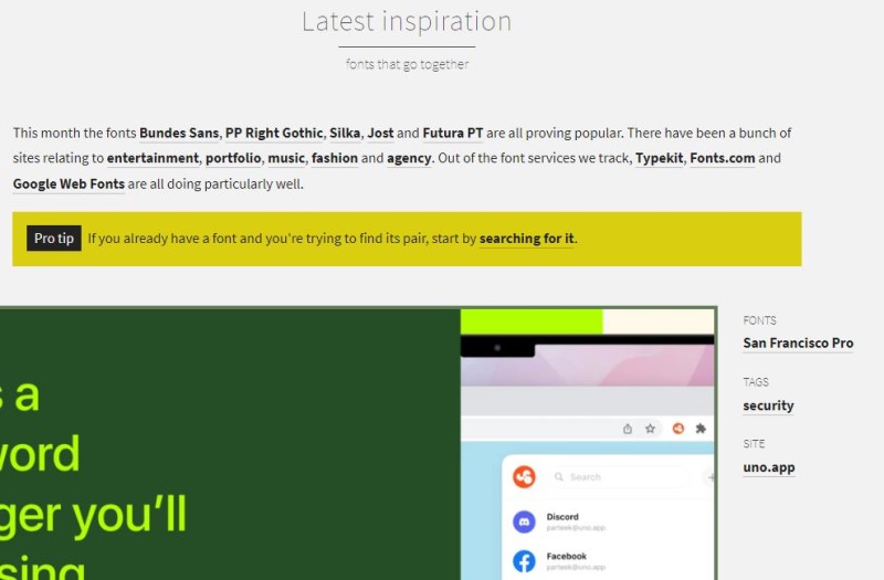
It was created by designer and developer Sebastiaan de With in 2013 as a way to help designers find inspiration and examples of high-quality typography in use.
The website features a collection of different types of websites, including blogs, portfolios, and e-commerce sites, and each example is accompanied by information about the font family, font size, and colour palette used in the design
FontInUse
FontInUse showcases typography examples in use across various mediums, including websites, print, and mobile apps.
It was launched in 2013 by Dutch designer and developer, Ivo Gabrowitsch, and has since grown into a popular resource for designers and typographers.
The website features a vast collection of typography examples from different industries and regions, accompanied by detailed information about the fonts used, the designers and agencies responsible for the work, and the purpose of the project
How to Choose the Right Font for Your Website – Summary
In conclusion, knowing how to choose the right font for your website is a crucial step in creating a cohesive and visually appealing design that enhances your overall user experience.
Factors such as readability, legibility, font size, spacing, colour contrast, brand identity, accessibility, and screen resolution should all be carefully considered when selecting a font for your website.
By following best practices such as using complementary fonts, maintaining font consistency, and considering web-safe fonts, you can create a design that aligns with your brand identity and provides a clear visual hierarchy for your content.
Ultimately, choosing the right font for your website requires a balance between functionality and aesthetics.
By considering your website’s design and font needs, and by implementing best practices for font selection and implementation, you can create a visually appealing and functional website that enhances your overall user experience and supports your brand identity.
If you need help with selecting the right fonts for your website please contact us.