10 Rules To Get The Perfect Colour Scheme For Your Website
Harnessing the Power of Color Scheme in Website Design
In website design, colour scheme plays a crucial role in shaping the user experience and communicating a brand’s personality. The right colour scheme can make a website stand out and engage visitors, while a poorly chosen one can turn them away.
So, how do you choose the perfect colour scheme for your website?
In this article, we’ll share 10 rules to help you make the right decision. From colour hunting and choosing a colour scheme type to match colours to your brand and website theme, considering emotions and meanings, using colour palettes as inspiration, and avoiding websites with bad colour schemes, we’ve got you covered.
We’ll also cover the importance of keeping it simple, using contrast effectively, considering background colour, and testing and iterating based on user feedback. By the end of this article, you’ll have a solid understanding of how to choose a colour scheme that perfectly represents your brand and resonates with your audience.

Colour 101
Understanding the fundamentals of colour is essential to creating an effective colour scheme for your website. In this chapter, we’ll explore the key terms and concepts of colour and colour theory.
Definition of Key Color Terms:
- Hue: The colour of an object or light wave, such as red, green, or blue.
- Saturation: The intensity or purity of a colour. Highly saturated colours are vibrant and bold, while desaturated colours are muted or pastel.
- Value: The brightness or darkness of a colour. High-value colours are light, while low-value colours are dark.
Colour Theory and Its Application to Website Design
Colour theory is the study of how colours interact with each other and how they can be combined to create an aesthetically pleasing colour scheme. It plays a critical role in website design, as colour can influence the mood, perception, and behaviour of visitors.

There are a few key principles of colour theory that are important to consider when choosing a colour scheme for your website:
- Colour Harmony: Colors that are pleasing to the eye are said to be in harmony with each other. Different colour schemes can create different levels of harmony, with some being more visually appealing than others.
- Contrast: Contrast refers to the difference between two colours. High contrast can make important elements stand out, while low contrast can create a more subtle and cohesive colour scheme.
- Emotions and Meanings: Different colours can evoke different emotions and convey different meanings. For example, red is often associated with passion or excitement, while blue is associated with trust or calmness. It’s important to consider the emotions and meanings associated with your brand and website when choosing a colour scheme.
- Background Color: The background colour of a website can affect the readability of text and the overall mood of the site. Choosing a background colour that complements the rest of the colour scheme is crucial for creating a cohesive design.
By understanding these key concepts of colour theory, you can create a colour scheme that effectively communicates your brand’s personality and resonates with your audience. Next, we’ll explore the first rule for choosing the perfect colour scheme: colour hunting.
How to Pick a Color Scheme
Before you begin choosing a colour scheme for your website, it’s important to start by colour hunting. This means gathering inspiration from various sources and exploring different colour combinations to find the ones that resonate with your brand and website theme.
Rule #1 Start by colour hunting
There are several ways to go about colour hunting for your website:
- Look to your brand: The colours of your brand can serve as a starting point for your website’s colour scheme. If you have a logo or established brand colours, consider incorporating them into your website design.
- Look to your competitors: While you don’t want to copy your competitors’ colour schemes, looking at their websites can provide inspiration for your own design. Take note of the colours they use and how they are combined to create a cohesive design.
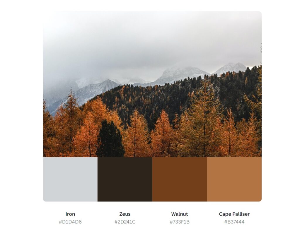
- Look to nature: Nature is full of beautiful colour combinations that can inspire your website design. Take a walk outside and pay attention to the colours of the sky, plants, and other natural elements.
- Look to colour palettes: Color palettes are pre-selected combinations of colours that can be used as a starting point for your own colour scheme. Websites like Coolors, Color Hunt, and Adobe Color provide free colour palettes that you can use for inspiration.
When colour hunting, it’s important to keep in mind the emotions and meanings associated with different colours. For example, warm colours like red and orange can evoke feelings of passion and excitement, while cool colours like blue and green can create a sense of calmness and trust.
Once you have gathered inspiration from various sources, start experimenting with different colour combinations. Use a colour wheel to find complementary or analogous colours, or try a monochromatic or square colour scheme for a more cohesive design. We can also help you find the perfect colour combination for your future website.
Remember to keep your brand and website theme in mind when choosing colours, and don’t be afraid to step outside of the box and try something new.
Next, we’ll explore the second rule for choosing the perfect colour scheme: choosing a colour scheme type.

Rule #2 Choose a colour scheme type
Once you have gathered inspiration and explored different colour combinations, it’s time to choose a colour scheme for your website. A colour scheme is a pre-selected group of colours that work together to create a cohesive design. There are several types of colour schemes to choose from, including monochromatic, complementary, and square.
- Monochromatic colour scheme: This type of colour scheme uses variations of a single colour. For example, you could use different shades of blue to create a monochromatic colour scheme.
- Complementary colour scheme: This type of colour scheme uses colours that are opposite each other on the colour wheel. For example, blue and orange are complementary colours.
- Analogous colour scheme: This type of colour scheme uses colours that are next to each other on the colour wheel. For example, blue, green, and purple are analogous colours.
- Triadic colour scheme: This type of colour scheme uses three colours that are equally spaced on the colour wheel. For example, red, yellow, and blue are triadic colours.
- Square colour scheme: This type of colour scheme uses four colours that are evenly spaced on the colour wheel. For example, blue, green, yellow, and red are square colours.
When choosing a colour scheme for your website, consider your brand and website theme. You want your colour scheme to complement your brand and create a cohesive design. Look at the colours of your logo or other branding elements and choose colours that work well with them.
Also, consider the emotions and meanings associated with different colours. For example, blue is often associated with trust and professionalism, while red can evoke feelings of passion and excitement. Choose colours that align with the emotions and message you want to convey through your website.
Next, we’ll explore the third rule for choosing the perfect colour scheme: matching colours to your brand and website theme.

Rule #3 Match colours to your brand and website theme
When choosing a colour scheme for your website, it’s important to consider your brand and website theme. The colours you choose should align with your brand’s identity and the message you want to convey through your website.
To match colours to your brand, look at your logo, brand guidelines, and other branding elements. What colours are already associated with your brand? Are there any colours that you want to avoid or emphasize? Use these colours as a starting point for your colour scheme.
Next, consider your website theme. What emotions and messages do you want your website to convey? Is your website theme more playful or serious? Warm or cool? These factors can influence the colours you choose for your colour scheme.
For example, if your brand is focused on eco-friendly products and your website theme is centred around nature, you might choose a colour scheme that incorporates shades of green, brown, and blue. These colours can evoke feelings of freshness, growth, and tranquillity, which align with your brand and website theme.
On the other hand, if your brand is focused on high-end fashion and your website theme is sleek and modern, you might choose a colour scheme that incorporates black, white, and metallics. These colours can evoke feelings of luxury, sophistication, and elegance, which align with your brand and website theme.
When matching colours to your brand and website theme, consider the overall balance and harmony of your colour scheme. Use colour theory principles such as contrast, balance, and saturation to create a cohesive and visually pleasing design.
Next, we’ll explore the fourth rule for choosing the perfect colour scheme: considering the emotions and meanings associated with different colours.

Rule #4 Consider the emotions and meanings associated with different colours
Colour can evoke powerful emotions and associations, and it’s important to consider the psychological effects of different colours when choosing a colour scheme for your website. Here are some common emotions and meanings associated with different colours:
- Red: associated with passion, love, and energy. It can also be associated with danger or warning.
- Orange: associated with warmth, enthusiasm, and excitement.
- Yellow: associated with happiness, optimism, and creativity.
- Green: associated with nature, growth, and health. It can also be associated with money or wealth.
- Blue: associated with calmness, trust, and stability. It can also be associated with sadness.
- Purple: associated with luxury, creativity, and spirituality.
- Pink: is associated with femininity, sweetness, and innocence.
- Brown: associated with earthiness, stability, and comfort.
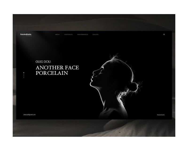
- Black: associated with sophistication, power, and elegance. It can also be associated with darkness or negativity.
- White: associated with purity, cleanliness, and simplicity.
It’s important to note that these associations can vary depending on cultural and personal context. For example, in Western cultures, white is often associated with purity and innocence, while in some Eastern cultures, it is associated with death and mourning.
When choosing a colour scheme for your website, think about the emotions and associations you want to evoke. If you’re designing a website for a healthcare company, for example, you might want to use calming blues and greens to evoke a sense of trust and stability. If you’re designing a website for a creative agency, on the other hand, you might want to use vibrant colours like orange and pink to convey a sense of energy and excitement.
Overall, understanding the emotions and meanings associated with different colours can help you choose a colour scheme that effectively communicates the message and tone of your website. Next, we’ll explore the fifth rule for choosing the perfect colour scheme: using colour palettes as inspiration.
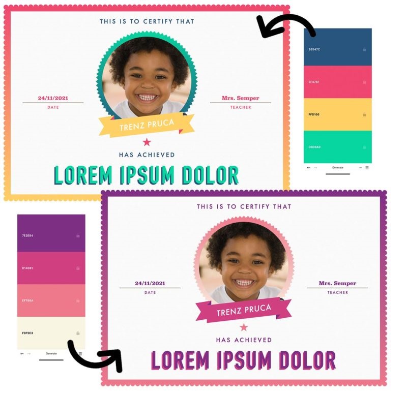
Rule #5 Use colour palettes as inspiration
Choosing the right colour palette for your website can be a daunting task. With so many colours and combinations to choose from, it’s easy to get overwhelmed. Fortunately, there are many resources available that can help you find inspiration for your colour scheme.
One of the best places to start is with colour palettes. A colour palette is a collection of colours that are designed to work well together. They can be used for a variety of purposes, from designing a logo to creating a website.
There are many websites and tools available that offer pre-made colour palettes for you to use as inspiration. For example, Adobe Color, Coolors, and Color Hunt are all popular websites that offer a wide range of colour palettes.
When using colour palettes as inspiration, it’s important to keep in mind the other rules we’ve discussed. Make sure the colours in the palette align with your brand and website theme and consider the emotions and meanings associated with each colour.
Additionally, you can use a colour palette as a starting point and tweak the colours to better suit your needs. For example, you might find a colour palette that you love, but want to swap out one of the colours for a different shade. This can help you create a unique colour scheme that still draws inspiration from a pre-made palette.
Overall, using colour palettes as inspiration can be a great way to jump-start your colour scheme and make the process of choosing colours a bit easier. In the next chapter, we’ll explore the sixth rule for choosing the perfect colour scheme: keeping it simple by limiting the number of colours used.
Rule #6 Keep it simple
When it comes to choosing a colour scheme for your website, it’s important to keep things simple. Using too many colours can be overwhelming and distracting, making it difficult for users to focus on the content of your website. By limiting the number of colours used in your colour scheme, you can create a clean and cohesive design that is easy on the eyes and encourages users to engage with your website.
So how many colours should you use? As a general rule of thumb, it’s best to limit your colour scheme to no more than three or four colours. This allows you to create a cohesive and visually appealing design without overwhelming your users with too much colour.
When choosing your colours, think about the role each colour will play in your design. For example, you might use one colour for your headers and another colour for your buttons. By assigning specific colours to specific elements of your design, you can create a visual hierarchy that makes it easier for users to navigate your website.
Another way to simplify your colour scheme is to use shades and tints of your chosen colours. This allows you to create variation and depth in your design without introducing additional colours that could detract from the overall look and feel of your website.
Overall, keeping your colour scheme simple and limiting the number of colours used can help you create a design that is both visually appealing and user-friendly. In the next chapter, we’ll explore the seventh rule for choosing the perfect colour scheme: using contrast to make important elements stand out.
Rule #7 Use contrast to make important elements stand out
Contrast is an important element of design that can help you create a visual hierarchy and draw attention to important elements of your website. By using contrast effectively, you can make key elements, such as your call-to-action buttons or important headlines, stand out and encourage users to engage with your website.
There are several ways to create contrast in your colour scheme. One common approach is to use a dark colour for your text and a light colour for your background. This creates a strong contrast that makes your text easy to read and draws the user’s attention to the content of your website.
Another way to create contrast is to use complementary colours. Complementary colours are colours that are opposite each other on the colour wheel, such as blue and orange or red and green. When used together, complementary colours create a strong contrast that can be eye-catching and visually appealing.
You can also use contrast to create a visual hierarchy on your website. For example, you might use a bright, bold colour for your call-to-action buttons, while using a softer colour for your secondary buttons. This helps draw the user’s attention to the most important element on the page and encourages them to take action.
It’s important to note, however, that using too much contrast can also be overwhelming and distracting for users. When using contrast, it’s important to strike a balance between making important elements stand out and creating a design that is visually appealing and easy on the eyes.
In the next chapter, we’ll explore the eighth rule for choosing the perfect colour scheme: considering the impact of background colour.

Rule #8 Consider the impact of background colour
The background colour of your website is an important aspect of your colour scheme that can have a significant impact on the overall look and feel of your design. The right background colour can help your content stand out and create a cohesive visual experience, while the wrong background colour can make your website appear unprofessional and unappealing.
When choosing a background colour, it’s important to consider several factors. One of the most important is the emotional impact of different colours. For example, blue is often associated with trust and reliability, while green is associated with nature and growth. By choosing a background colour that matches the emotional tone of your website, you can create a design that feels cohesive and well-thought-out.
It’s also important to consider the contrast between your background colour and the other colours on your website. A background colour that is too similar to your text colour can make it difficult to read, while a background colour that is too bright or bold can be overwhelming and distracting. By choosing a background colour that provides a strong contrast to your text and other design elements, you can create a design that is easy to read and visually appealing.
Another factor to consider when choosing a background colour is the overall tone and style of your website. If you’re looking for a website for a serious business, you may want to choose a muted or neutral background colour that conveys professionalism and sophistication. On the other hand, if you’re designing a website for a creative or artistic brand, you might choose a bold and vibrant background colour that reflects the brand’s personality and style.
It’s important to note that the impact of your background colour can vary depending on the device and screen size that your website is viewed on. Make sure to test your colour scheme on a variety of devices to ensure that your background colour looks great on all screen sizes and resolutions.
Next, we’ll explore the ninth rule for choosing the perfect colour scheme: avoiding websites with bad colour schemes.
Rule #9 Avoid websites with bad colour schemes
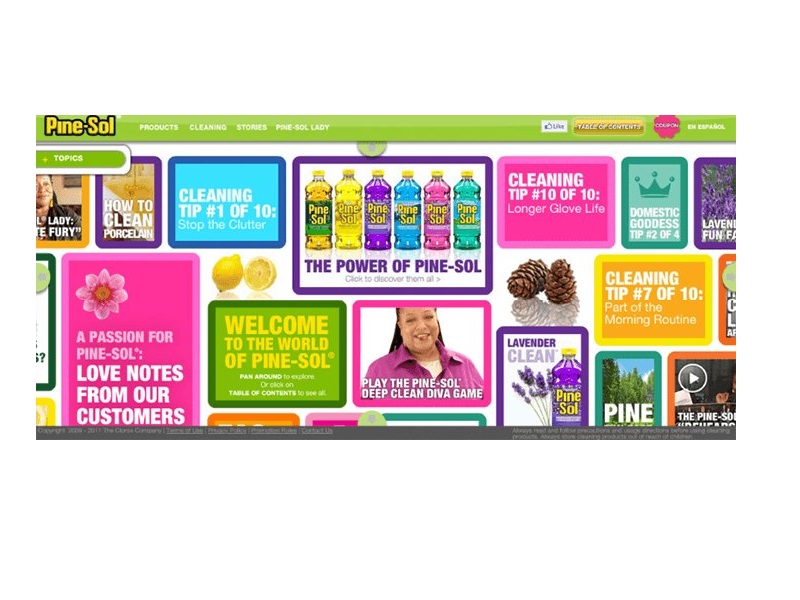
As you’re selecting a colour scheme for your website, it’s important to be aware of common colour mistakes and to avoid emulating websites with bad colour schemes. A poorly designed colour scheme can make your website difficult to read, unprofessional, and unappealing to visitors. Here are some common colour mistakes to avoid:
- Clashing Colors: Avoid using colours that clash or are too similar to each other. This can make it difficult to read the text and create a chaotic and unorganized look.
- Too Many Colors: Using too many colours can make your website look busy and overwhelming. It’s best to limit your colour palette to a few carefully selected hues.
- Bright and Bold Colors: While bright and bold colours can be attention-grabbing, they can also be overwhelming and difficult to look at for extended periods. Consider using muted tones and neutrals to create a more relaxed and professional look.
- Inconsistent Colors: Make sure that your colour scheme is consistent across all pages of your website. Inconsistencies in colour can make your website look unprofessional and amateurish.
- Conflicting Branding: Your colour scheme should be consistent with your brand and logo. Avoid using colours that conflict with your branding or that have negative connotations associated with your brand.
By being aware of these common colour mistakes and avoiding websites with bad colour schemes, you can create a website that is visually appealing and easy to use. Remember to test your colour scheme on different devices and screen sizes to ensure that it looks great on all platforms.
Finally, we’ll explore the tenth rule for choosing the perfect colour scheme: testing and iterating based on user feedback.

Rule #10 Test and iterate based on user feedback
After you’ve selected a colour scheme for your website, it’s important to test it and gather feedback from users. This will help you understand how people are interacting with your website and whether your colour scheme is effective in communicating your brand message and guiding users through your site. Here are some tips for testing and iterating your colour scheme:
- User Testing: Do user testing to gather feedback from real users. Observe how they interact with your website, where they click, and whether they find it easy to navigate.
- Use Heat Maps: Heat maps can help you understand where users are focusing their attention on your website. This can help you identify areas that may need more contrast or attention.
- A/B Testing: A/B testing involves testing two different colour schemes with different groups of users to determine which is more effective. This can help you identify which colours are most effective at communicating your message and guiding users through your site.
- Analyse Website Analytics: Use website analytics to gather data on how users are interacting with your website. Look for patterns in user behaviour and adjust your colour scheme accordingly.
- Iterate: Use the feedback you receive from testing and analytics to iterate and improve your colour scheme. Continuously test and adjust your colour scheme to ensure that it is effective in communicating your brand message and guiding users through your site.
By testing and iterating your colour scheme, you can create a website that is both visually appealing and effective in achieving your business goals. Remember to keep your user’s needs and preferences in mind and use feedback to continuously improve your website’s colour scheme.
Choosing the perfect colour scheme for your website can be a daunting task, but by following these ten rules, you can create a colour scheme that is visually appealing, consistent with your brand, and effective in communicating your message.
Remember to start by colour hunting, choose a colour scheme type, match colours to your brand and website theme, consider emotions and meanings associated with different colours, use colour palettes as inspiration, keep it simple, use contrast, consider the impact of background colour, avoid websites with bad colour schemes, and test and iterate based on user feedback.
With these rules in mind, you can design a website that stands out and effectively communicates your brand message to your audience.